Grey and green are on the same page

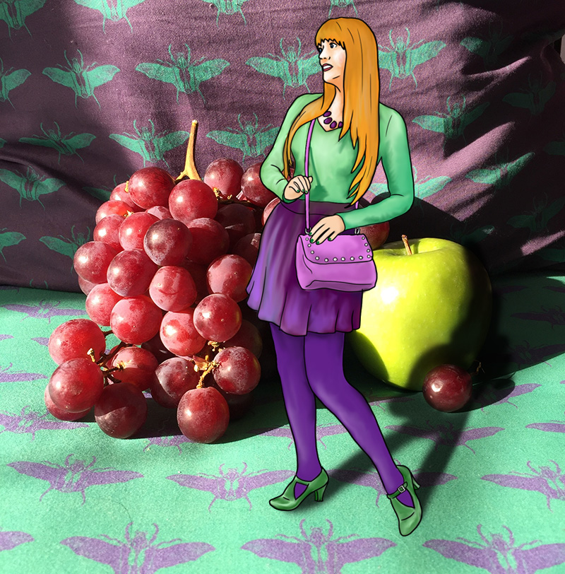
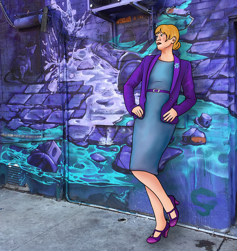
Crisp, cool, and collected. These are terms that can be used for both grey and green. While green evokes all that is organic, such as forests and glens, and grey is rather industrial, with images of smoke and steel coming to mind, both are calm colours. Unflappable, resolved, wise, and serene. Paired together they are perfect for a professional look. Think business meeting served with a luncheon.

29-quee-grey-and-green

Pink and grey are chill but judgemental

Grey is cool, crisp, and content and fully unconcerned. It is pleased to listen to both sides of an argument without ever taking a stance one way or the other. Pink, on the other hand, is prickly and opinionated, and very much invested in whatever is happening at any given moment, though it won’t always voice its concerns. By paring a bold, fiery pink with a steady, smokey grey, it will be clear that you too are one with varied, steadfast opinions, and a mind of your own, though the exact nature of those opinions will remain shrouded in mystery.

28-quee-pink-and-greyb

Pink and blue are a delight

Pink is sweet, and so is blue. Blue isn’t typically thought of in cloying terms the way pink often is, but when paired with pink its inner sentimentality is revealed. Blue is calm, clever, controlled, and always kind, but never aggressive. You wouldn’t think of pink as being particularly assertive either, but it is, after all, just watered-down red. But even when veering towards fuschia, pink isn’t overly forceful when paired with blue. These are, of course, colours we associate with newborns. Together their giving, non-threatening natures bolster each other to reveal a candy-coated treat. Perfect for garden parties, but maybe avoid this pairing during business meetings.

27-quee-pink-and-blue

Yellow and pink are united in hope

Yellow and pink are perhaps the two least appreciated colours on the spectrum. Yellow because it is too bright and optimistic to be taken seriously, and pink because it is associated to femininity and therefore derided. What does it say about our society that what is sunny, uplifting, good, and kind is also rejected? It’s safe to say that yellow is unpopular because it is so eye-catching. People are afraid to wear it because they are afraid to draw attention to themselves. Isn’t there something tragic about that? And what of pink, which also frightens people? Men avoid it because they are afraid of being seen as feminine, but even women often avoid it for the same reason. Why is our society so negative, so harsh, so cruel and cutting? Why can’t we combine two symbols of goodness and be proud of that pairing? Most people love summer, yet still avoid these icons of sugar and sunshine. Let us triumph in our caring, uplifting tendencies, and wear both yellow and pink with pride!
24-quee-pink-and-yellow

Purple and Yellow just wanna have fun

Purple doesn’t mess around. It’s serious and regal and not to be trifled with. Even as a demure pastel it is still authoritative and calm. But yellow is so joyful and bright that it turns a pairing with purple into a whimsical adventure. Purple and yellow are the colours of Easter, which suggests spring and renewal, but also the fun of an egg hunt and overindulging in chocolate treats. Do not resist this journey, allow yellow to lead you into a rousing escapade, while purple pretends not to be impressed, but secretly smiles with amusement.

25-quee-yellow-and-purple

Red and Purple are in charge

Red is bold, purple is regal. Red is passionate, purple is arrogant. Red is powerful, purple is authoritative. These colours are right next to each other on the spectrum, and purple syphons all of red’s dynamic energy while borrowing some of blue’s serenity to emerge with undeniable sovereignty. Together, red and purple are are potent mix. Striking, brave, undeniable, impossible to ignore, and in full control. Do not try to compete, as you will lose.

24-quee-red-purple

Blue and red are a power couple

It’s safe to say that blue and red are the two most important colours in the spectrum. Along with yellow, they make up the primary colours, but yellow is so bright and cheery that it rarely gets to take center stage with its peers. Blue and red on the other hand, are both basic, standard, ever-present, but never disrespected for this ubiquity. They are both well liked, and well used, though are complete opposites. Blue is cold, red is hot. Blue is calm, red is passionate. Blue is soothing, red is seering. When used together they somehow evoke the cheeriness of yellow without its childishness. Blue’s coolness tempers red’s fiery nature, and red’s brightness elevates blue’s sedate nature. Elegant, respectful, bold, admirable – paired up, it’s safe to say, they are power personified.

23-quee-blue-red

Green and Blue are mostly the same

Blue is so calm and reassuring it can often be seen as a neutral. It is crisp and cool, no-nonsense, but also soothing and helpful.  All of these terms could also apply to green, though it also carries an earthiness which makes it a tad warmer than blue. Green and blue can be tricky when paired since they are so close together on the spectrum. In fact, some languages don’t even differentiate between the two colours, and only have one term for both. Yet they are distinct, as green is a combination of blue and yellow and therefore contains yellow’s optimism and positivity, perfectly balanced with blue’s calm intelligence. A vibrant, emerald green will pair well with a baby blue, just as cobalt will work well with lime. Juxtaposed in this way, both blue and green are elevated, and become more bold than either would be on their own. Do not underestimate these cool tones, as their forces combined will heat up a room.
22-quee-green-blueb

Purple and Green fight it out

Both purple and green are secondary colours, and often associated with villains in comic books. This villainy is natural for both when they are juxtaposed because while they are tonally similar, they are very much at odds. Both refuse to concede to the other, and both attempt to be dominant when juxtaposed. Both have a cool element, from their common blue, and both also have a certain warmth, which green gets from yellow and purple gets from red. Certainly, from this perspective, purple wins, since red will beat yellow in almost any battle, but somehow green puts up a hell of a fight when battling it out with purple.

21-quee-purple-green

Blue defers to Purple

Blue is business casual. Always a safe bet, blue can be worn with anything, because it can be interpreted as a neutral in almost any shade except perhaps the most vibrant of jewel tones. Purple, on the other hand, is very particular. It is lush and opulent. Decisive and daring. Paring a bright purple with a toned-down blue allows the purple to shine, and take its place in the spotlight, just as it deserves. Of course, the opposite works as well. A pastel violet will work very nicely with a bold cobalt, lending a sweetness to something vivid, yet even in this context, the violet will be dominant, because purple is so very powerful, and blue so very accommodating.

20-quee-blue-purple