Green and Blue are mostly the same

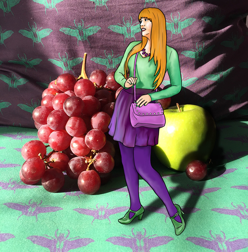
Blue is so calm and reassuring it can often be seen as a neutral. It is crisp and cool, no-nonsense, but also soothing and helpful.  All of these terms could also apply to green, though it also carries an earthiness which makes it a tad warmer than blue. Green and blue can be tricky when paired since they are so close together on the spectrum. In fact, some languages don’t even differentiate between the two colours, and only have one term for both. Yet they are distinct, as green is a combination of blue and yellow and therefore contains yellow’s optimism and positivity, perfectly balanced with blue’s calm intelligence. A vibrant, emerald green will pair well with a baby blue, just as cobalt will work well with lime. Juxtaposed in this way, both blue and green are elevated, and become more bold than either would be on their own. Do not underestimate these cool tones, as their forces combined will heat up a room.
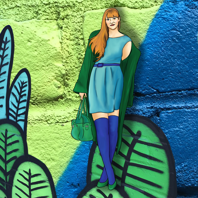
22-quee-green-blueb

Purple and Green fight it out

Both purple and green are secondary colours, and often associated with villains in comic books. This villainy is natural for both when they are juxtaposed because while they are tonally similar, they are very much at odds. Both refuse to concede to the other, and both attempt to be dominant when juxtaposed. Both have a cool element, from their common blue, and both also have a certain warmth, which green gets from yellow and purple gets from red. Certainly, from this perspective, purple wins, since red will beat yellow in almost any battle, but somehow green puts up a hell of a fight when battling it out with purple.

21-quee-purple-green

Blue defers to Purple

Blue is business casual. Always a safe bet, blue can be worn with anything, because it can be interpreted as a neutral in almost any shade except perhaps the most vibrant of jewel tones. Purple, on the other hand, is very particular. It is lush and opulent. Decisive and daring. Paring a bright purple with a toned-down blue allows the purple to shine, and take its place in the spotlight, just as it deserves. Of course, the opposite works as well. A pastel violet will work very nicely with a bold cobalt, lending a sweetness to something vivid, yet even in this context, the violet will be dominant, because purple is so very powerful, and blue so very accommodating.

20-quee-blue-purple

Orange and Blue are a safe risk

Orange is the colour of autumn, and of the 1970s, so even though an autumnal palette simultaneously evokes warmth and the cozy crispness of fall, it can also cause traumatic flashbacks to shag carpeting, brutalist architecture, and questionable fashions.

Blue is similarly contradictory. It is well loved, and ubiquitous in both fashion and administrative work, but this popularity is exactly what makes it so basic, so safe, so essentially neutral.

It is these dichotomies that make the pairing of orange and blue so daring. Orange is one of the most controversial colours (only yellow is more difficult to pull off), and blue is the most agreeable. Together they allow for rather low-risk experimentation.

19-quee-orange-blueb

Green and Orange are joyful prosperity

Orange is optimism and cheerfulness. It is youthful without being infantile and warm without being hot. Green is abundance, wealth, and growth. It is calming but never stagnant. Together, green and orange are ebullient and comforting. A walk in the park on a sunny day. Do be careful though, to wear sunscreen during your walk, because orange also represents danger, and green can be sickly.

18-quee-green-orangeb