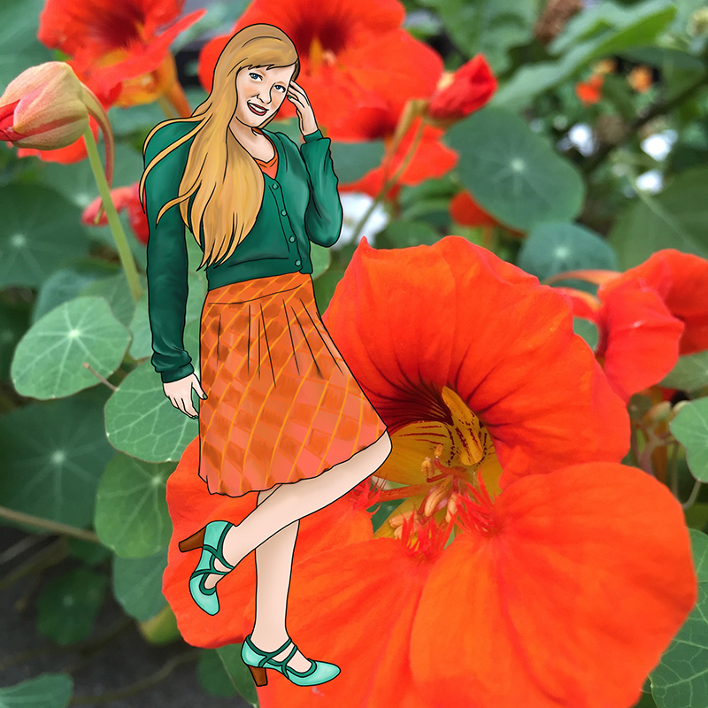
Orange is the colour of autumn, and of the 1970s, so even though an autumnal palette simultaneously evokes warmth and the cozy crispness of fall, it can also cause traumatic flashbacks to shag carpeting, brutalist architecture, and questionable fashions.
Blue is similarly contradictory. It is well loved, and ubiquitous in both fashion and administrative work, but this popularity is exactly what makes it so basic, so safe, so essentially neutral.
It is these dichotomies that make the pairing of orange and blue so daring. Orange is one of the most controversial colours (only yellow is more difficult to pull off), and blue is the most agreeable. Together they allow for rather low-risk experimentation.


