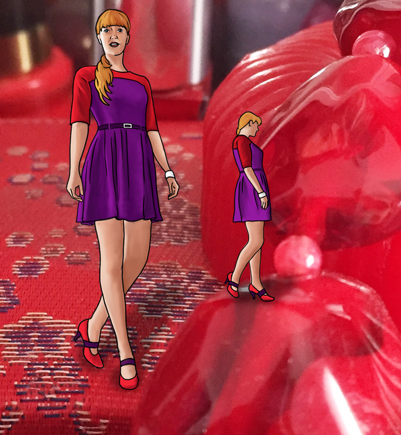
Rose, violet, and aqua

Pink and purple are sweet and feminine, and with turquoise in the mix, you have quite the My Little Pony experience. Aqua is crisp and cool, dusty rose is mellow, and violet is soothing, yet together these colours are a bold choice that could never be considered dull.
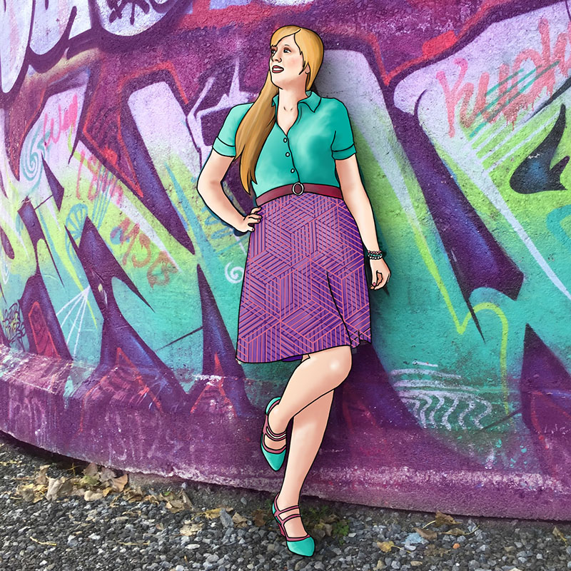
37-quee-rose-violet-aqua

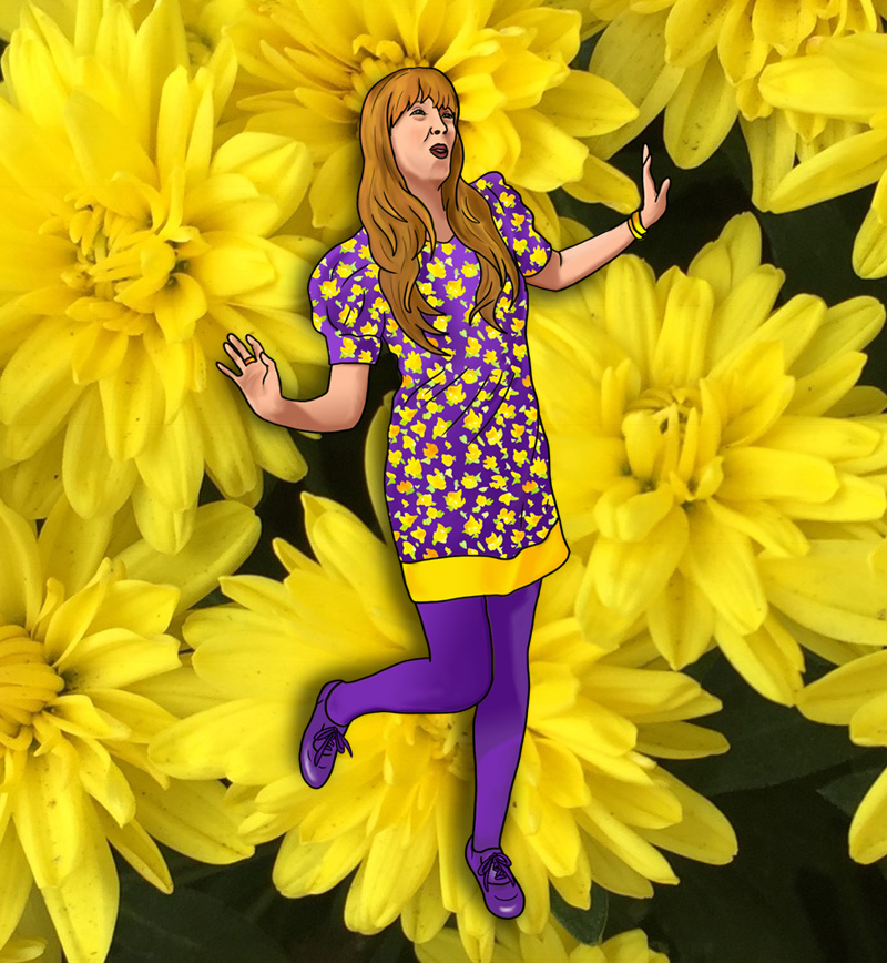
Purple and Yellow just wanna have fun

Purple doesn’t mess around. It’s serious and regal and not to be trifled with. Even as a demure pastel it is still authoritative and calm. But yellow is so joyful and bright that it turns a pairing with purple into a whimsical adventure. Purple and yellow are the colours of Easter, which suggests spring and renewal, but also the fun of an egg hunt and overindulging in chocolate treats. Do not resist this journey, allow yellow to lead you into a rousing escapade, while purple pretends not to be impressed, but secretly smiles with amusement.

25-quee-yellow-and-purple

Red and Purple are in charge

Red is bold, purple is regal. Red is passionate, purple is arrogant. Red is powerful, purple is authoritative. These colours are right next to each other on the spectrum, and purple syphons all of red’s dynamic energy while borrowing some of blue’s serenity to emerge with undeniable sovereignty. Together, red and purple are are potent mix. Striking, brave, undeniable, impossible to ignore, and in full control. Do not try to compete, as you will lose.

24-quee-red-purple

Purple and Green fight it out

Both purple and green are secondary colours, and often associated with villains in comic books. This villainy is natural for both when they are juxtaposed because while they are tonally similar, they are very much at odds. Both refuse to concede to the other, and both attempt to be dominant when juxtaposed. Both have a cool element, from their common blue, and both also have a certain warmth, which green gets from yellow and purple gets from red. Certainly, from this perspective, purple wins, since red will beat yellow in almost any battle, but somehow green puts up a hell of a fight when battling it out with purple.

21-quee-purple-green

Blue defers to Purple

Blue is business casual. Always a safe bet, blue can be worn with anything, because it can be interpreted as a neutral in almost any shade except perhaps the most vibrant of jewel tones. Purple, on the other hand, is very particular. It is lush and opulent. Decisive and daring. Paring a bright purple with a toned-down blue allows the purple to shine, and take its place in the spotlight, just as it deserves. Of course, the opposite works as well. A pastel violet will work very nicely with a bold cobalt, lending a sweetness to something vivid, yet even in this context, the violet will be dominant, because purple is so very powerful, and blue so very accommodating.

20-quee-blue-purple

Purple is regal


08-quee-purple

Purple is regal,
Self-assured.
The taste of purple is pie filling,
berries hot, juicy, sweet,
delicious.
The sound of purple is lasting,
loud but pleasant.
The feel of purple is prickling
yet soft,
Crushed velvet.
Burst.
Purple is in demand,
Smart and in control.
Flowing and gliding.
Beautiful.

Purple & Green

If Purple represents royalty and elitism, and green represents envy and wealth, then it’s no wonder purple and green have become so well known as a villainous colour combination. Just as the primary colours of red and blue evoke the idea of Superman, the secondary colours of purple and green evoke the Joker. Even the Hulk, who is technically a good guy, is violent and out of control when he turns green. Green is usually a calming colour but I guess those ripped up purple shorts really set him off.

purplegreenboard1

Purple and Green look good together but they are a contentious couple. They are both on the cool end of the spectrum, but Purple also contains passion and can be volatile. Green, typically serene and self-possessed, finds herself irritated by Purple’s snobby demeanor. Still, they are a striking pair, and as with Blue and Purple, as long as one of them is willing to tone it down and be pastel, they are sure to turn heads.

purplegreenboard2

Arm in arm, they go to a fundraising gala together. They are both charitably minded, though Purple does it more for prestige and Green is in it for the tax break. It is a black tie ball, and they are in a floor length gown, and a smart tuxedo. They spend the bulk of the night on the dance floor, with breaks for elegantly sipping champagne as they hobnob with other jet-setters who are there to see and be seen. They bid on some silent auction items, and win a bejeweled necklace. Green is uncomfortable with this since she can’t be sure if the jewels are conflict-free, but Purple doesn’t care and she looks forward to wearing it on her next night out. As the evening winds down, they finally head home, give one another an air kiss and retire to separate bedrooms.

purplegreenboard3


Purple & Peach

Peach is a little bit orange, a little bit pink. A refreshing fruit smoothie on a hot summer day. Purple is the intersection of blue and red, and carries all the intellectual superiority of blue, with all the dangerous passion of red, making purple an arrogant elitist of the highest order.

purple-peach-board1

Purple doesn’t like to share the spotlight, but Peach comes in as a friendly, unassuming friend, and promptly takes over, turning Purple into nothing but an accessory, as in the outfit above. Purple is, of course, aghast at first, but then realizes this is a chance to relax for a bit. She doesn’t always have to be in charge.

purple-peach-board2

These two won’t spend a long time together though, because Purple can only be ignored for so long. She will come to resent Peach’s bubbly dominance, and push her to the side. Purple isn’t used to competition, she sees herself as a de facto winner. Peach is amused by this resentment and plays along for a while, pretending to be surprised, but eventually she will move on without putting up too much of a fight, because she’s got better things to do with her time, like spread joy wherever she goes. If Purple can’t appreciate that, it’s none of Peach’s concern.

purple-peach-board3


Blue & Purple

You might not think at first that Blue and Purple would be good friends, perhaps because they are too similar. Both on the cool end of the spectrum, both collected and controlled. In other ways you might think they are too different. Blue is calm and down-to-earth, while Purple is passionate and regal.

bluepurpleboard1

But the trick to getting these two colours to get along is to make sure one is a hue and the other is a shade. Or one could be a tint and the other a shade, or one a tint and the other a hue. That is to say, one colour is dominant, and the other is complimentary. Violet is quite content to be demure when paired with a show-stopper like cobalt, and the airiness of a powder or baby blue will work nicely with eggplant’s strength.

bluepurpleboard2

The ideal date scenario for Blue and Purple is a sight-seeing ride in an ornate cycle rickshaw. Blue will suggest a bicycle ride but Purple is too much of a snob to power her own locomotion. The rickshaw is a compromise as Purple had wanted the romance of a horse-drawn carriage, but the dubious ethics of this are too much for Blue. They end up at a fine arts museum where Purple proceeds to explain all the paintings to Blue, and Blue politely nods, allowing Purple to pontificate so as not to offend her but still feeling the need to add her own two cents now and again, since she’s actually studied art history. Then they go to a fancy restaurant for dinner; Purple’s choice. Purple picks out the wine, but Blue suggests the appetiser. They discuss politics, religion, and current affairs but not their own relationship. They know they are not soulmates, and won’t spend their lives together, but they respect each other as intellectual equals and consider the date a success.


bluepurpleboard3

Plum

If you read my post on turquoise, you know colour perception can be subjective and ambiguous. I decided to make turquoise a separate Colour Theory category from both blue and green because of a particular dress I owned that turned out to be divisive in terms of what colour people perceived it to be. The exact same thing has happened with purple and burgundy, so I’ve created a board for plum.

plum-board1

One day, at work, I wore the outfit pictured above. In my mind the main colour displayed was burgundy, but I got called “purple lady” and was accused of dressing like a grape. Interesting, I thought. Then, months later, as I was mentally preparing to write this blog post, I went in to work in an outfit that to my mind was decidedly purple, and another coworker commented that she liked my maroon outfit. Clearly there is a very fine line between purple and burgundy. You could argue that there is a fine line between any two colours that sit next to each other on the spectrum. The word spectrum itself defines a continuum. But I’ve chosen to write an entire post about plum because the line between purple and burgundy seems to be particularly fine. I’m not even sure the word “plum” is the right one to use. Unlike turquoise, there doesn’t seem to be a definitive name for the colour(s) between purple and burgundy. Fuschia and magenta could fall within this range, but they have more of a pink, rather than red influence, so for the purposes of this exercise, plum will have to do.

As I was creating my plum photo collage, I struggled to decide what belonged in the purple camp, what was more maroon, and what plum really meant. What do you think of my choices? Do you think plum even deserves its own category? If plum does, doesn’t indigo? After all, indigo (midway between blue and purple) is an actual colour on the spectrum, so why not give it equal treatment? Well, the answer, for me, is that no one’s ever accused me of wearing blue when I thought I was wearing purple, and vice versa.

plum-board2

Interestingly, as I was scouring my neighbourhood for plum objects I discovered that a lot of foods fall into this colour range. Plums obviously, but also grapes, onions, beets, eggplant, and blueberries when smooshified. So perhaps plum, as a colour, is symbolically indicative of health and vitality, while also conveying depth, and brooding moodiness. It doesn’t really know what it wants to be, and refuses to be pinned down, but is also plentiful in nature. Plum: an enigma, wrapped in a smoothie.