Blue and red are a power couple

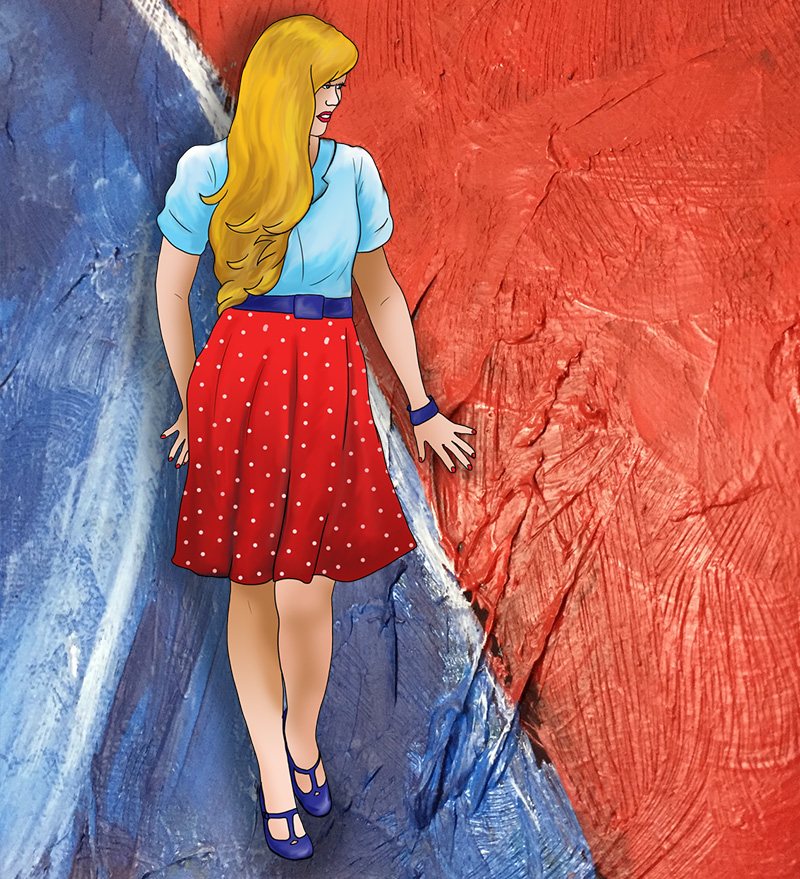
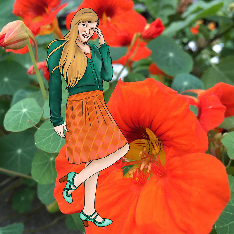
It’s safe to say that blue and red are the two most important colours in the spectrum. Along with yellow, they make up the primary colours, but yellow is so bright and cheery that it rarely gets to take center stage with its peers. Blue and red on the other hand, are both basic, standard, ever-present, but never disrespected for this ubiquity. They are both well liked, and well used, though are complete opposites. Blue is cold, red is hot. Blue is calm, red is passionate. Blue is soothing, red is seering. When used together they somehow evoke the cheeriness of yellow without its childishness. Blue’s coolness tempers red’s fiery nature, and red’s brightness elevates blue’s sedate nature. Elegant, respectful, bold, admirable – paired up, it’s safe to say, they are power personified.

23-quee-blue-red

Green and Blue are mostly the same

Blue is so calm and reassuring it can often be seen as a neutral. It is crisp and cool, no-nonsense, but also soothing and helpful.  All of these terms could also apply to green, though it also carries an earthiness which makes it a tad warmer than blue. Green and blue can be tricky when paired since they are so close together on the spectrum. In fact, some languages don’t even differentiate between the two colours, and only have one term for both. Yet they are distinct, as green is a combination of blue and yellow and therefore contains yellow’s optimism and positivity, perfectly balanced with blue’s calm intelligence. A vibrant, emerald green will pair well with a baby blue, just as cobalt will work well with lime. Juxtaposed in this way, both blue and green are elevated, and become more bold than either would be on their own. Do not underestimate these cool tones, as their forces combined will heat up a room.
22-quee-green-blueb

Purple and Green fight it out

Both purple and green are secondary colours, and often associated with villains in comic books. This villainy is natural for both when they are juxtaposed because while they are tonally similar, they are very much at odds. Both refuse to concede to the other, and both attempt to be dominant when juxtaposed. Both have a cool element, from their common blue, and both also have a certain warmth, which green gets from yellow and purple gets from red. Certainly, from this perspective, purple wins, since red will beat yellow in almost any battle, but somehow green puts up a hell of a fight when battling it out with purple.

21-quee-purple-green

Blue defers to Purple

Blue is business casual. Always a safe bet, blue can be worn with anything, because it can be interpreted as a neutral in almost any shade except perhaps the most vibrant of jewel tones. Purple, on the other hand, is very particular. It is lush and opulent. Decisive and daring. Paring a bright purple with a toned-down blue allows the purple to shine, and take its place in the spotlight, just as it deserves. Of course, the opposite works as well. A pastel violet will work very nicely with a bold cobalt, lending a sweetness to something vivid, yet even in this context, the violet will be dominant, because purple is so very powerful, and blue so very accommodating.

20-quee-blue-purple

Orange and Blue are a safe risk

Orange is the colour of autumn, and of the 1970s, so even though an autumnal palette simultaneously evokes warmth and the cozy crispness of fall, it can also cause traumatic flashbacks to shag carpeting, brutalist architecture, and questionable fashions.

Blue is similarly contradictory. It is well loved, and ubiquitous in both fashion and administrative work, but this popularity is exactly what makes it so basic, so safe, so essentially neutral.

It is these dichotomies that make the pairing of orange and blue so daring. Orange is one of the most controversial colours (only yellow is more difficult to pull off), and blue is the most agreeable. Together they allow for rather low-risk experimentation.

19-quee-orange-blueb

Green and Orange are joyful prosperity

Orange is optimism and cheerfulness. It is youthful without being infantile and warm without being hot. Green is abundance, wealth, and growth. It is calming but never stagnant. Together, green and orange are ebullient and comforting. A walk in the park on a sunny day. Do be careful though, to wear sunscreen during your walk, because orange also represents danger, and green can be sickly.

18-quee-green-orangeb

Pink and Green are interchangeable

Green is the colour of nature, and is associated with growth, freshness, fertility, and wealth, but also jealousy, and in some cultures, illness. Pink is associated with femininity and therefore nurturing and soothing qualities, but sometimes its so over the top in its sweetness that its sickly sweet. While these colours are on opposite ends of the spectrum, they are actually pretty much the same. Perhaps it is because they are opposites that they get along so well.

17-quee-pink-green

Black and Pink are on the same team

Don’t be afraid of pink. People rarely wear it in office settings, probably because they want to be taken seriously and pink still carries a girly connotation, (though this wasn’t always the case) and of course, we still live in a society that considers all things feminine to be negative or at least inferior to masculine things.

Black, on the other hand is utterly gender neutral, and is, of course, itself a neutral. Black is classic, but equally modern. Let’s face it, if all the colours (and neutrals) were to fight for dominance, black would win, but pink would put up a good fight.

16-quee-black-pink

Black and White are not at odds

In light, black is the absence of colour. In pigment, it’s all colours mixed together. Either way black represents space, the infinite, never-ending, all-encompassing. It is dark and mysterious, and symbolizes mourning and evil in Western cultures. In clothing, an all-black outfit can be goth or elegant, depending on styling. Black is the easiest neutral to work with because it goes with absolutely everything. It is safe, and no-fault, while simultaneously evoking power and sophistication.

White symbolizes purity, innocence, and cleanliness. It is the opposite of black: in light it is all colours, in pigment it is none. White is a blank slate, an empty canvas. While black is the colour of death and mourning in western culture, in other cultures white fills this role, due to the idea of death being the beginning of a new life, of renewal.

15-quee-black-white

White is pure

14-quee-white

White is pure,
good.
The taste of white is snow,
bland but refreshing.
The sound of white is snow,
falling lightly,
quiet calm.
The feel of white is snow
like cotton.
White is kind,
bright,
unspoiled,
appropriate,
and goes with
everything.